IBM Plex Corporate Typeface Font
About IBM Plex Corporate Typeface Font
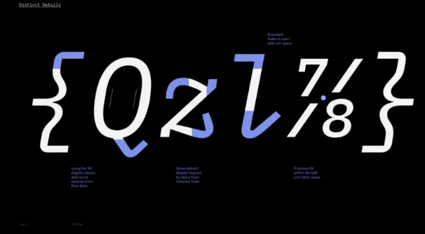
IBM Plex Corporate is a versatile, modern sans-serif typeface designed for clarity, professionalism, and consistency across corporate communications. Part of the IBM Plex superfamily, it balances humanist readability with technical precision, making it ideal for branding, corporate reports, presentations, and digital interfaces. The font’s clean lines, open letterforms, and extensive character set provide flexibility for multiple languages and contexts. IBM Plex Corporate reinforces IBM’s visual identity while offering designers a reliable, contemporary, and highly legible typeface for both print and digital projects.
Font Variants
- IBM Plex Corporate Typeface Font Regular
- IBM Plex Corporate Typeface Font Bold
- IBM Plex Corporate Typeface Font Italic
Language Support
Character Map
License Information
IBM Plex Corporate is released under the Open Font License (OFL), allowing free use for personal and commercial projects. Redistribution and modification are permitted under the terms of the license, ensuring legal and flexible usage across print, digital, and branding applications.
IBM Plex Corporate Typeface Font Generator
Create Stunning Text Designs Instantly
Bring your ideas to life with our powerful Image Generator. This versatile tool allows you to fully customize your texts, giving you complete control over font style, size, color, and alignment.
Enhance your designs by selecting background colors, gradients, or transparent options. Combine them with carefully chosen font colors to create visually appealing graphics that perfectly match your brand identity.
The Image Generator supports high-quality SVG and PNG outputs, ensuring crisp visuals for websites, social media, and print materials.
With this tool, designing custom text graphics has never been easier. Whether it's for a logo, banner, or personal project — create professional visuals in seconds without any design software.